To create KPI graphs for your Dashboard first add or select a tab and click the 'Add graph' button. This will open the 'Add graph' form.
Naming your graph
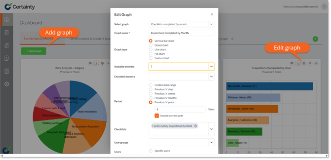
When you add a graph to your Dashboard, it will automatically be given the same title as the option in the dropdown. You can change this title by adding a new title in the ‘Graph Name’ field.
Choosing and changing graph type
Graph display options will vary depending on the nature of the data, but presentation options typically include:
- Vertical bar chart
- Pie chart
- Horizontal chart
- Donut chart
- Line chart
Setting and changing the data reporting period
Period defines the date range of the data in your graph, and you can either choose a custom date range (Custom Date Range) or a specific number of days, weeks, months or years prior to and including the present day (Previous ‘X’ Days, etc.).
Setting and changing user correlations
When the data in a graph correlate to users who have completed checklists (e.g. number of checklists completed by user), you can choose to show data specific to certain users by either choosing users by name (Select Users) or a set number of users with the highest data count relevant to that graph (Top ‘X’ Users).
Setting and changing site and site group correlations
When the data in a graph correlate to sites (e.g. number of checklists completed by site), you can choose to show data specific to certain sites by choosing sites or site groups.
Setting and changing checklist correlations
You can define what checklist data should be included in your graph by choosing a specific checklist.